Hounslow Recycling Hub is a web application which provides concise and practical information about recycling in the London Borough of Hounslow. The website was created during the 4th year of the MSci Computer Science degree programme at King’s College London, for the module 7CCSMGPR Impact Accelerator.
Table of Contents
Overview
The module was a collaborative effort between KCL (King’s College London) and AWS (Amazon Web Services). Throughout the year, students attended AWS-led workshops to gain insight and knowledge about AWS methodology and technology. The goal was to then apply this knowledge to a real-world scenario.
Students were split into teams and assigned a public sector organisation to be their challenge sponsor. Each challenge sponsor had a problem that they believed could be solved using modern technology approaches. It was up to the teams to communicate with their challenge sponsors and learn what that problem is, figure out how to solve it and then implement the solution using AWS. Regular meetings with the challenge sponsors ensured that the teams were on the right track and that the solutions they were developing were in line with their sponsor’s expectations.
I was part of the Black Team, and our challenge sponsor was the London Borough of Hounslow. Their challenge to us was as follows:
"Our specific challenge for you relates to a Greener Hounslow as one of our high-level priorities."
"The objective is to enhance existing channels of communication to our residents by the provision of clear, engaging, enhanced (potentially interactive) promotion and signposting of services available and how to access them with the objective of increasing resident uptake and minimising misuse of bin types, fly-tipping etc."
Our solution to this challenge was Hounslow Recycling Hub.
For more information about the project, you can read the full report or watch the project video.
Development Process
In the following sections, I will discuss the development process that took place, from the initial design of the application all the way to the final product.
Initial Design
We started development by creating a fast prototype of the structure of our web application. The first version can be seen in the figure below.
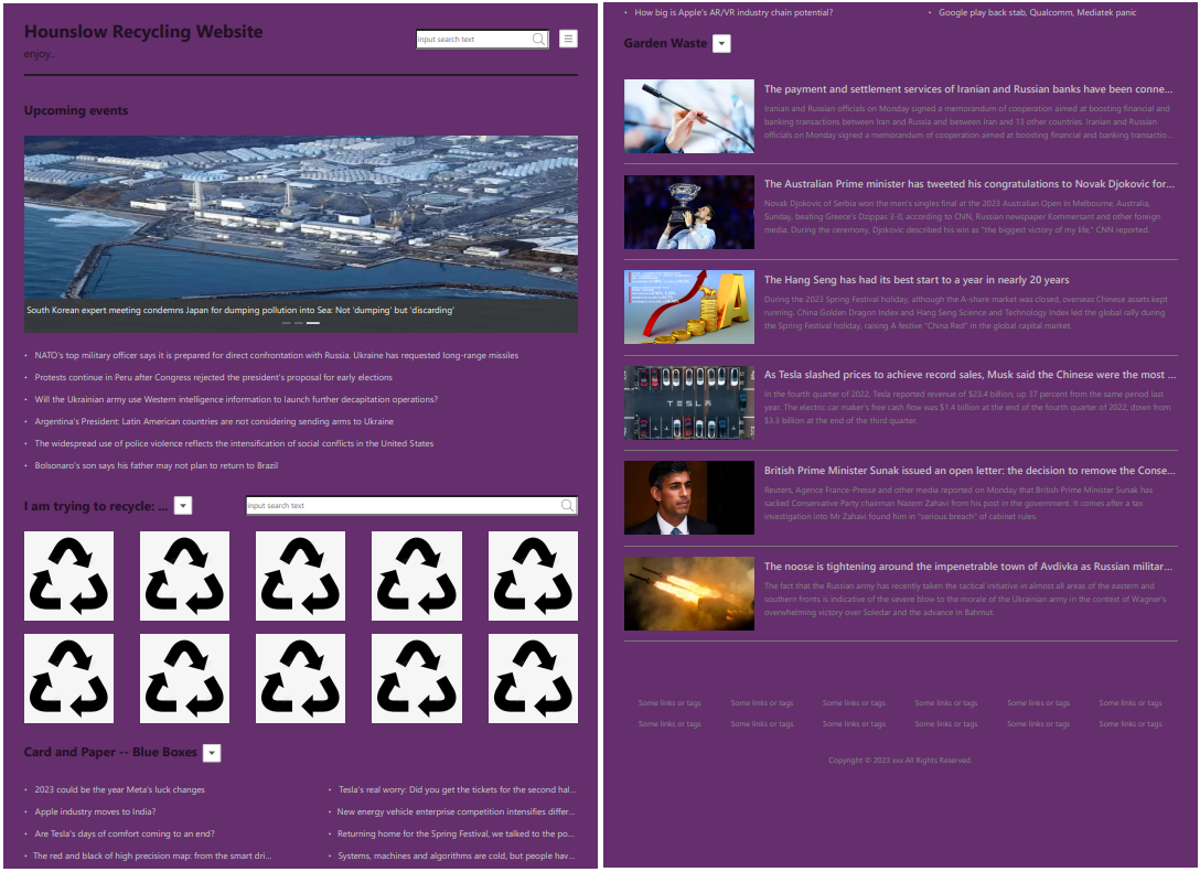
We chose a one-page design to facilitate navigation throughout the application. This decision was based on the fact that existing recycling information in the original Hounslow borough website is spread across multiple pages. This makes it harder for users to find the content they are looking for. It can also cause redundancy, which unnecessarily increases the volume of information and makes maintenance more difficult (increasing the probability of inconsistency). In addition, research shows that pop-ups and transitions through many pages are perceived with a “high degree of irritation and dissatisfaction”. Through the one-page design we aim to minimise this type of interaction and at the same time keep the content minimal which leads to easier and more intuitive navigation through the web application.
The colour scheme we selected is similar to the one used in the original Hounslow website. This should speed up adoption of the new platform as it can be perceived as an extension of the original website, which residents are already used to.
After these decisions were finalised, we created a basic empty web page and deployed it using AWS Amplify. The technology stack used for the front-end implementation includes Node.js, Next.js, TypeScript and React.
Main Features
The next steps were focused on implementing the main features of the web application. With the help of empathy maps, we came up with the most common scenarios for using a recycling web application:
-
Residents want to use a recycling bin in the right way but need information about what can and cannot be disposed of using it.
-
Residents want to recycle an item but do not know what bin/service they can use.
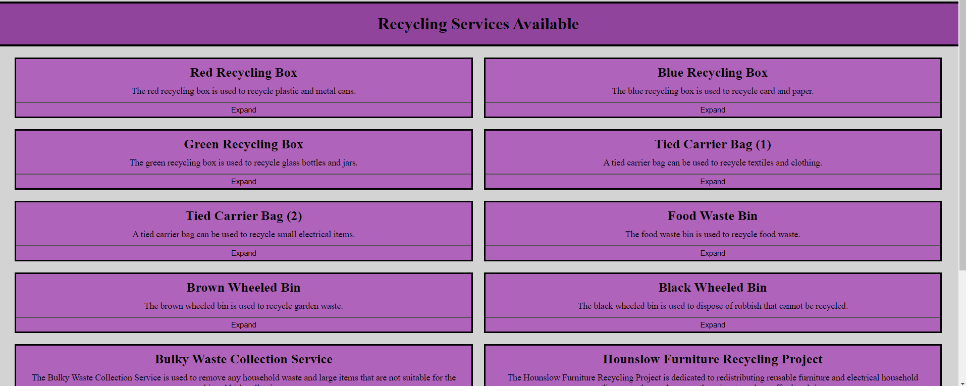
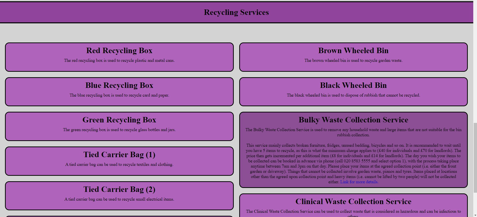
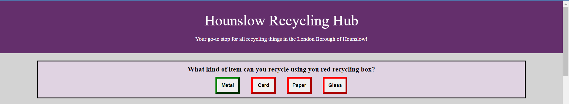
Our background research showed us that the greatest barrier to recycling is uncertainty, so we focused on providing clear and concise guidance about the different recycling services available. We decided to extract the most important information about each recycling service (how it is used, what can and cannot be recycled using it, when the collection takes place etc.) and put it in accordions in one section of our web application.
An accordion is simply a container that can be opened to display more information. Since we are using a single-page design, it is important that we don’t overwhelm the user with too much at once. By using accordions, we could hide most of the information - except the name of the service and a short description - until the user requires it. This allows only the most relevant information to be displayed at any given moment.
The recycling service accordions solved the first common use case mentioned above (residents want to use a recycling bin in the right way). The initial version of the recycling service accordions is presented in the figure below.
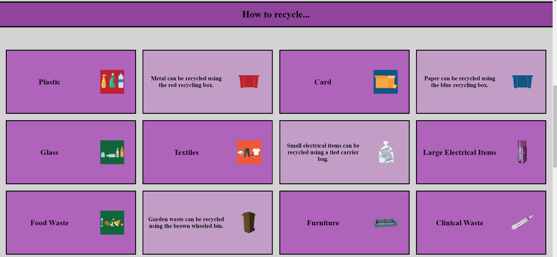
For the other main use case (users want to recycle an item and do not know what service or bin they can use), we implemented a grid of item-type cards, representing different types of items. On the front of each card was the name and picture of the item type. When clicked, the cards would flip to show the name and picture of the correct recycling service to use.
The idea behind the cards was to allow the user to easily see all the different types of items that can be recycled (by presenting them in a grid). The user could also easily find out how to recycle each type of item (by flipping the card). The flipping functionality meant that once again only relevant information is shown to the user. Moreover, it was a more interactive method of information retrieval, which is one of the goals set by our challenge sponsor. The first iteration of the item-type cards can be found in the figure below.
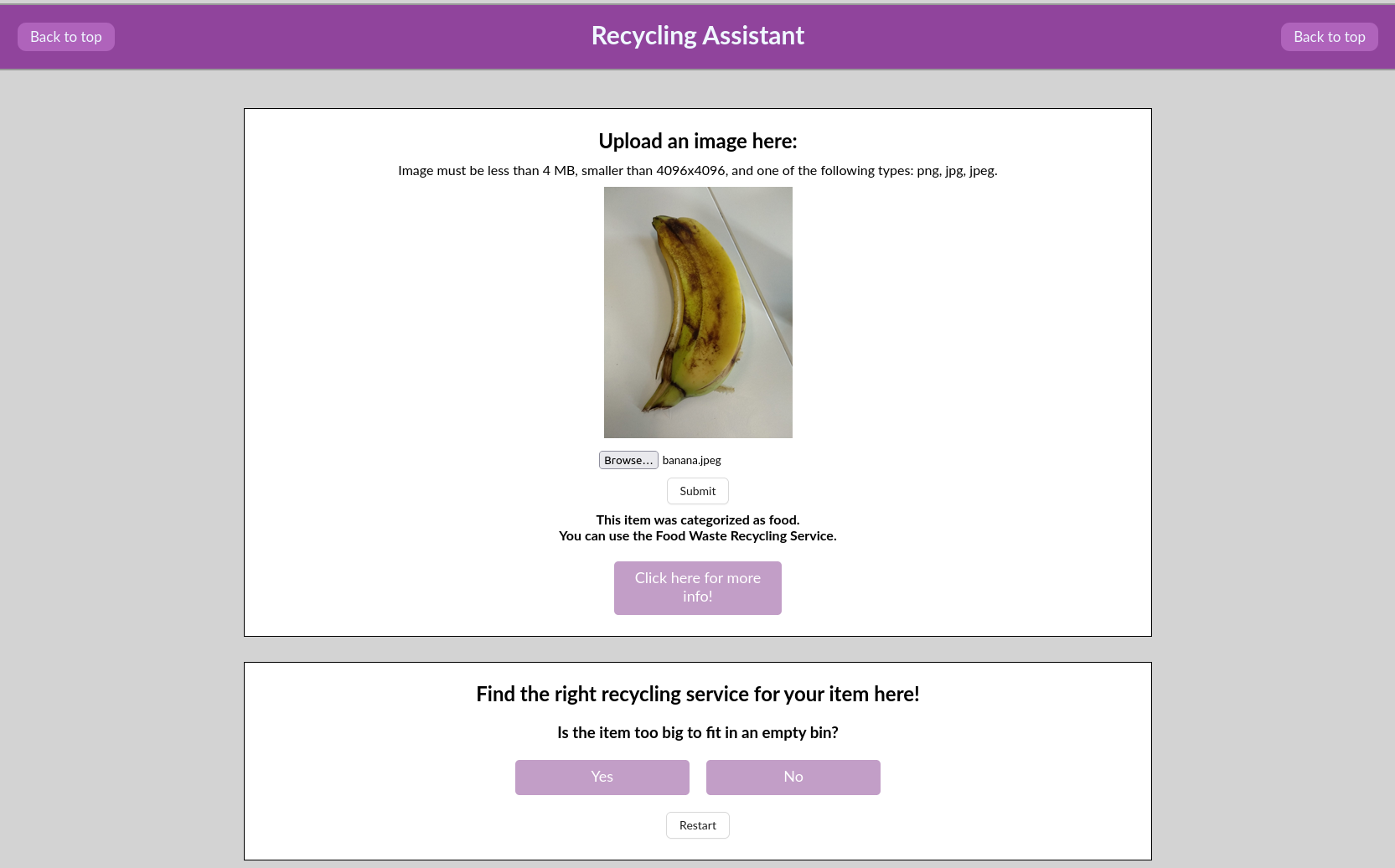
The importance of the problem of uncertainty as well as the desire to make the website even more interactive made us implement a feature that we called “recycling assistant” (shown in the figure below). It provides an interactive way to determine the correct recycling service for a specific item. In order to find out which bin they should use, the user answers a series of short questions about the item they want to recycle.
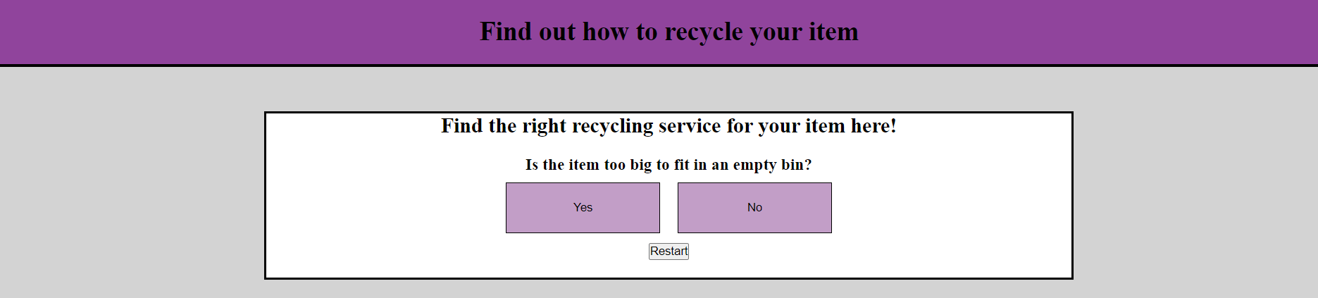
Although it may seem that the recycling assistant has similar functionality to the item-type cards described above, it actually provides guidance for items that are harder to categorise directly. Additionally, the question-and-answer process can have a positive impact by helping residents build better decision-making habits so that they are able to choose the correct service even without using the app.
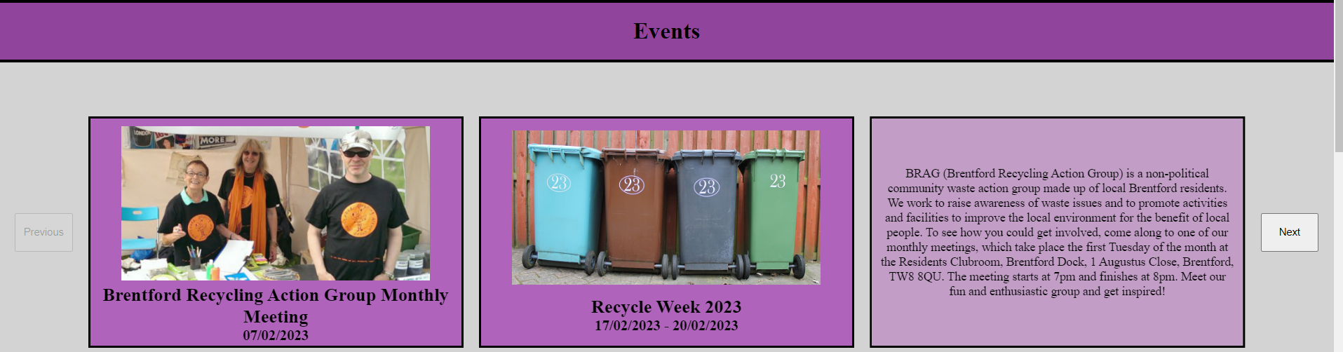
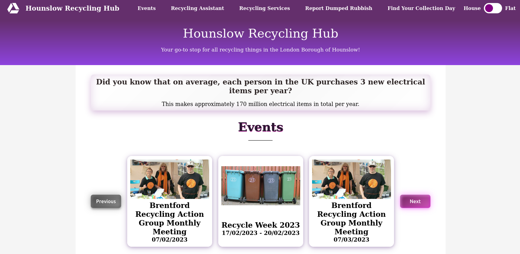
The last basic feature we chose to implement is related to the problem of information being spread over multiple websites and the need for better communication channels. While exploring the existing platforms, we discovered that there is no dedicated section for announcements of cancelled collection days, and that some events promoting recycling awareness in the borough (e.g. the Brentford Recycling Action Group) are not located on the main council website.
To solve this problem, we implemented a section containing a carousel of recycling-related events (shown in the figure below). Once again, we stood by our commitment to display minimal and relevant content, and each event card was designed to show only the name and date of the event. However, similar to the item-type cards, each card is flippable and more information can be found on the back. Like before, this makes the process more interactive for the user.
These features created the first draft of our product. As per our iterative development approach, during this phase we mainly concentrated on creating functionality and not on delivering style.
Prototype
In the middle of the second term, we polished the functionalities we had implemented and added several enhancements to produce a prototype. In this stage, we also started to refine the user interface by unifying the style of the web page and making each section clearly separated and noticeable.
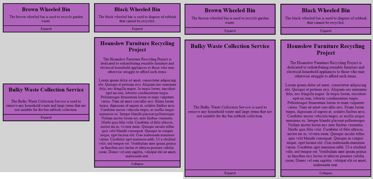
Based on the feedback we got from the Blue Team during one of the lab sessions, we made the following changes to the design of the accordions:
- We made the accordions bigger.
- This makes them easier to read, especially for older people.
- We removed the buttons that open/close the accordions. Instead, clicking anywhere on an accordion will have this functionality.
- The other alternative was to make the buttons bigger and therefore easier to click, but we thought removing them was the more user-friendly option.
- We changed the way the accordions open, so that they slide past each other.
- Initially, expanding one accordion would change the corresponding accordion in the other column to have the same size. However, this resulted in a lot of redundant whitespace. On the other hand, when we made it so that both accordions expanded together, it looked unnatural. These two options can be seen in the first figure below. The Blue team suggested a third option, where the accordions can slide past each other rather than be in strict rows. The updated version of the accordions is shown in the second figure below.
Finally, we added one more feature to our application in order to make it more engaging and to increase interest in recycling. Recycling appeals more to people who have a better understanding of the process and its benefits. The Hounslow website already contains this sort of information, but it is presented as several paragraphs of text, which is not very appealing to casual users.
We decided to extract this information (plus additional data from the Internet) and create a list of so-called “fun facts”, each one only 2-3 brief sentences long. By presenting one of these facts (chosen at random each time the page is loaded) at the top of the page, we provide a low-effort way for users to learn more about recycling.
In addition to the facts, to increase interaction even further, we came up with a list of simple multiple-choice quiz questions. Here, we took advantage of a simple psychological trick - people love clicking buttons!
We didn’t want to distract users from the main functionality of the website too much, so we decided not to display both a fact and a quiz question at the same time, but to choose one or the other every time the page is loaded. By being embedded directly into the page, it is easily noticeable and does not require more effort than reading some sentences or clicking a button. We believe that this will naturally draw users’ attention and will help educate them about recycling.
Improvements
After the prototype demonstration, we collected useful feedback which we integrated during the next phase of our iterative development process.
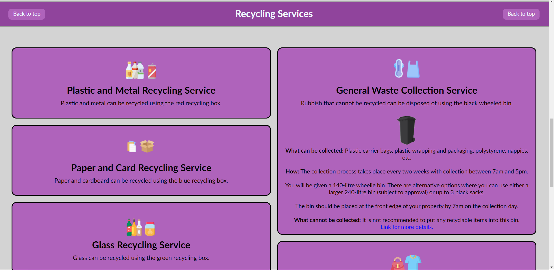
We started by addressing a comment stating that we have too many sections on the page. As a result, we refined our initial plan. Since the main function of the item-type cards was to lead the user to the appropriate recycling service, we decided to merge these two sections together. We added pictures of the items to be recycled to each accordion. We also changed the accordion names to focus on the actual services instead of the bins, to make it easier to find the required service. When an accordion is expanded, in addition to the old information, we added a picture of the bin to be used.
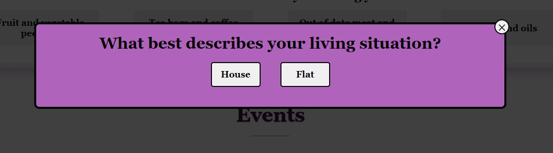
Another very important point that the feedback from our challenge sponsor emphasised was that there is a difference between the recycling services (and bins) available for residents living in flats compared to those living in houses. As a result, we researched this further. Keeping in line with our commitment to only show information that is relevant to the user, we decided to create two versions of our page: one for residents living in houses and one for residents living in flats.
When a user opens the webpage for the very first time, a small popup will appear asking them what type of home they live in. This preference will be saved in their browser for the next time they visit the page. Users can easily change between the two versions using a toggle button at the top of the page. In addition to providing more accurate content, this feature allows us to personalise the user experience to some extent.
Apart from that, based on peer reviews, we made further improvements to our user interface. We went through another iteration of refinements to the overall design (including font and borders). We also added a navigation bar that stays on the screen while scrolling to provide direct access to each section of our website.
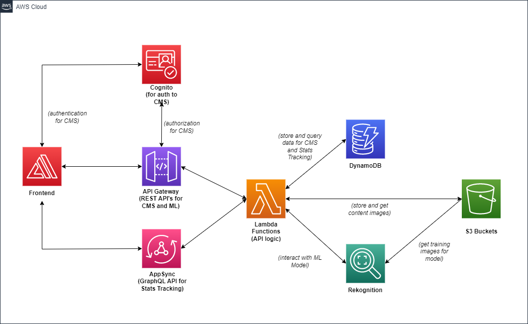
The last feature we worked on during this stage was the creation of a DynamoDB database to store the website content and fetch it when the web page is accessed. This is a vital feature as the content of the web application should be kept up-to-date to be usable. API Gateway and Lambda functions were used to implement the functionality needed for the application to communicate with the database. A REST API was developed to support basic CRUD requests.
Extra Features
Finally, we implemented some extra features which enhance the capabilities of our product and allow for a better user experience.
Firstly, we focused on achieving the objective of “using a wide variety of state-of-the-art technologies such as Machine Learning and Internet of Things to develop new insights and decision-making opportunities that ultimately lead to a more sustainable borough” as stated by “A Greener Hounslow”.
Through the different phases of our project, we came to the conclusion that the main goal of our web application is to make the process of choosing the correct recycling service easier (again helping to reduce the uncertainty in users) and more interactive. Hence, we decided to extend the recycling assistant feature by using a machine learning model to analyse user-uploaded images of items and determine their category (and therefore the correct recycling service to use).
To create the machine learning model, we used Amazon Rekognition. First, we needed to collect a dataset of images of items in different recycling categories. For the most common categories (e.g., plastic, paper, rubbish) we used open-source datasets found on Kaggle. For the remaining categories (including garden, clinical and bulky waste), we collected images manually from the open-source platform Unsplash.
In the end, we had 12 different categories of items with about 600 images each (here, it should be noted that there was significant variance in the data quantity between the services; for some of them like clinical waste, bulky waste and small electrical items, the images we managed to collect were much fewer: 58, 132 and 212 respectively):
- plastic
- metal
- paper
- cardboard
- glass
- food
- textile
- small electrical
- bulky waste
- garden waste
- clinical waste
- rubbish
We utilised an S3 Bucket to upload the dataset and used the category of each item as a label. Next, we trained an Amazon Rekognition multinomial classification model with our custom labels. Then, we needed to make a decision about the way images will be passed from the UI of our web application to the ML model. We had to choose between two options - either to pass the raw image directly to the model through a Lambda function or to upload it to an S3 Bucket which then connects to Amazon Rekognition to send the image for analysis.
The first option imposed a 4MB file size limit, while the second one required us to store users’ images. Valuing data privacy and given the fact that image size can be reduced with compression, we chose to pass the image directly. This was implemented through a request sent from the application to a simple HTTP API Gateway which triggers a Lambda function connecting to the Amazon Rekognition client. The result of the analysis is then displayed to the user.
In the event that the confidence of the classification result is not high enough, or if an error occurs, the default category to be displayed is rubbish. While categorising items that can be recycled as rubbish is of course unfortunate, it is preferable in comparison to categorising rubbish as items that can be recycled, as this can contaminate the whole recycling bin and cause its rejection. This also values availability of the service by providing users with a result at all times.
Another important point to discuss is the minimal confidence score for which the model should return results (as opposed to falling back on the default response of rubbish). Using manual testing, we started at a confidence score of 90%, for which we got too few results (but with accuracy of 100% for all of them). This means that in many cases we just automatically categorised items as rubbish because the model was not confident enough to label them otherwise. Lowering the confidence score to maximise the portion of returned results that are correct, we settled on a confidence score of 70%.
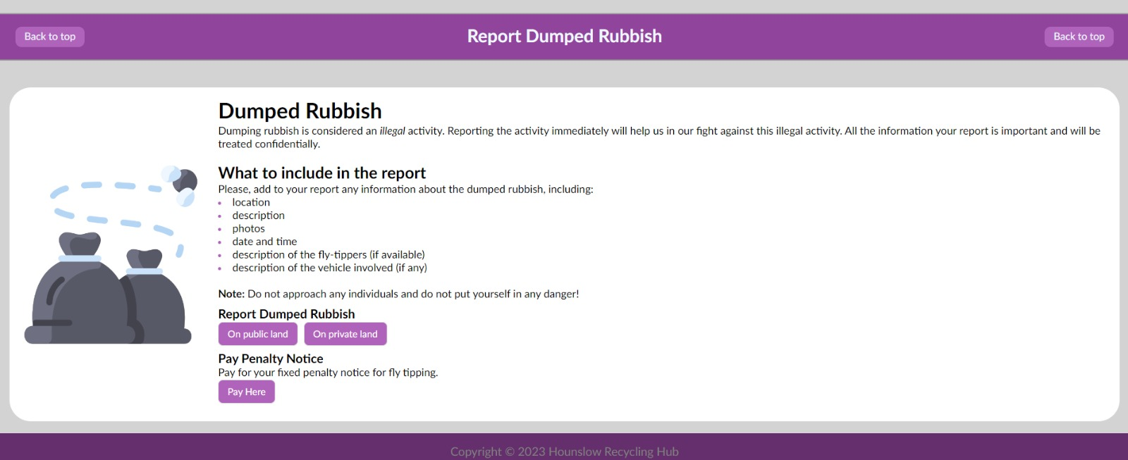
One last feature we implemented that could help achieve a better recycling culture and a cleaner borough was a section for reporting dumped rubbish. Similar information is available on the original Hounslow website, however it is not well structured and refers to some outdated or irrelevant web pages which we fixed.
While we mainly concentrated on the residents of Hounslow as our main target users, we also considered the borough’s council members, who will need to support the website and provide relevant and up-to-date content.
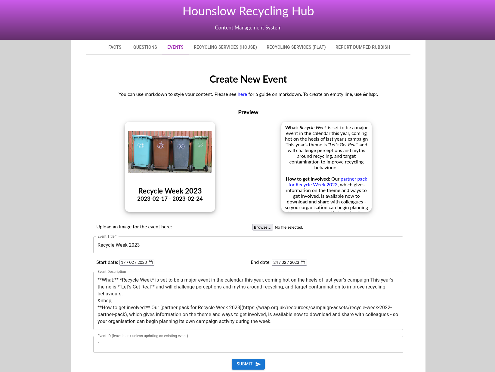
To make this process as smooth and easy as possible, we created a content management system (CMS), which allows anyone with an administrative account to create, update and delete content from the database by using an intuitive dashboard, without the need for assistance from IT specialists. By making information maintenance easy, we hope to ensure that information on the website stays valid.
Apart from that, after discussions with our challenge sponsor, we agreed that keeping track of statistics related to the use of the web application may be useful to them in identifying trends and common problems with recycling in the borough. These statistics include:
- the number of page visits (to analyse the popularity of the application)
- the number of answers to quiz questions (to track user engagement and knowledge)
- the number of accordion expansions (to check which services are needed most often)
- the number of times an event card is flipped (noting the events popular amongst the residents)
To accomplish this, we used AppSync.
Lastly, we polished the design of our website to finalise the UI and make it as appealing and clear as possible.
Reflection
This project was a major piece of work during which I had the opportunity to learn and develop various skills. I will discuss three such skills here.
React
Prior to this project, I had very little experience with Node, Next, React etc. This was also my first time using AWS, so I had to learn a lot of new things. AWS in particular I found to be challenging, perhaps because it was quite different to what I was used to; luckily there were a lot of guides and tutorials available online. By the end of the project, I was much more comfortable using the tech stack, although my AWS knowledge still left a lot to be desired. However, I believe my biggest progress was with React.
React is a front-end JavaScript library for building user interfaces. It allows you to create components corresponding to different elements of the UI and then combine them together to create more complex components.
The first challenge I came across was simply getting started. It was a very daunting task: when I checked out our initial project repository, I was met with many files and folders whose name and purpose I did not understand. I decided to break the problem down and set myself a small task: find out where I should write my code, create an empty HTML webpage and run it.
I watched a few “Getting Started” tutorials on YouTube and became familiar with the file structure of Next.js, the basics of using Node and how to create simple React components (although at this early stage they were nothing more than glorified HTML - see the figure below). After the first week of development, while I was still a long way away from being comfortable with React, the task no longer seemed as imposing as before.
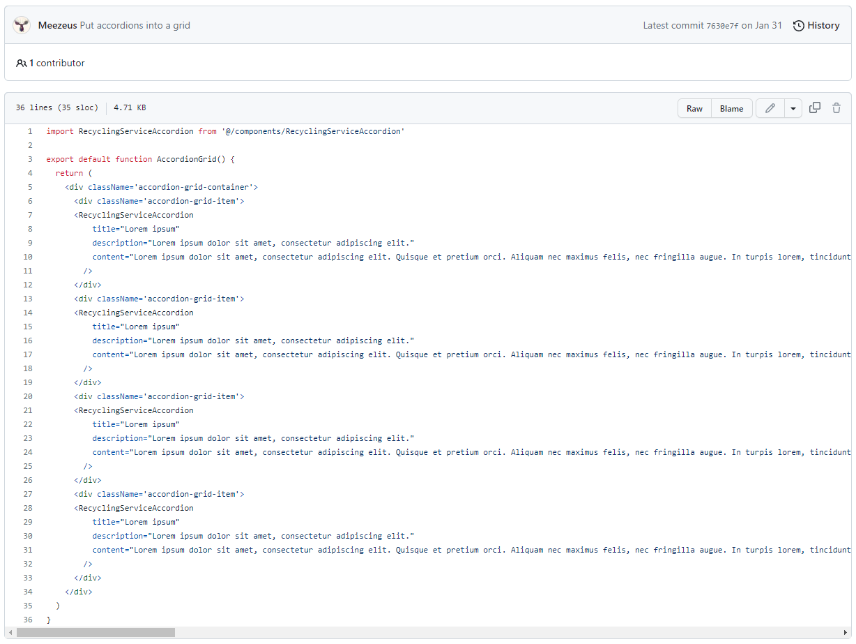
My main responsibility in our team was creating the front end of the website and so over the course of the next few weeks I spent a lot of time learning and experimenting. I relied heavily on Google searches to help me, especially during those early weeks. At this point in time, I didn’t even know how to create a simple CSS grid (which I needed in order to display the accordions in two columns). However, I am pleased that I learnt about it early on, as I found the grid layout to be very useful and I employed it in a wide variety of components.
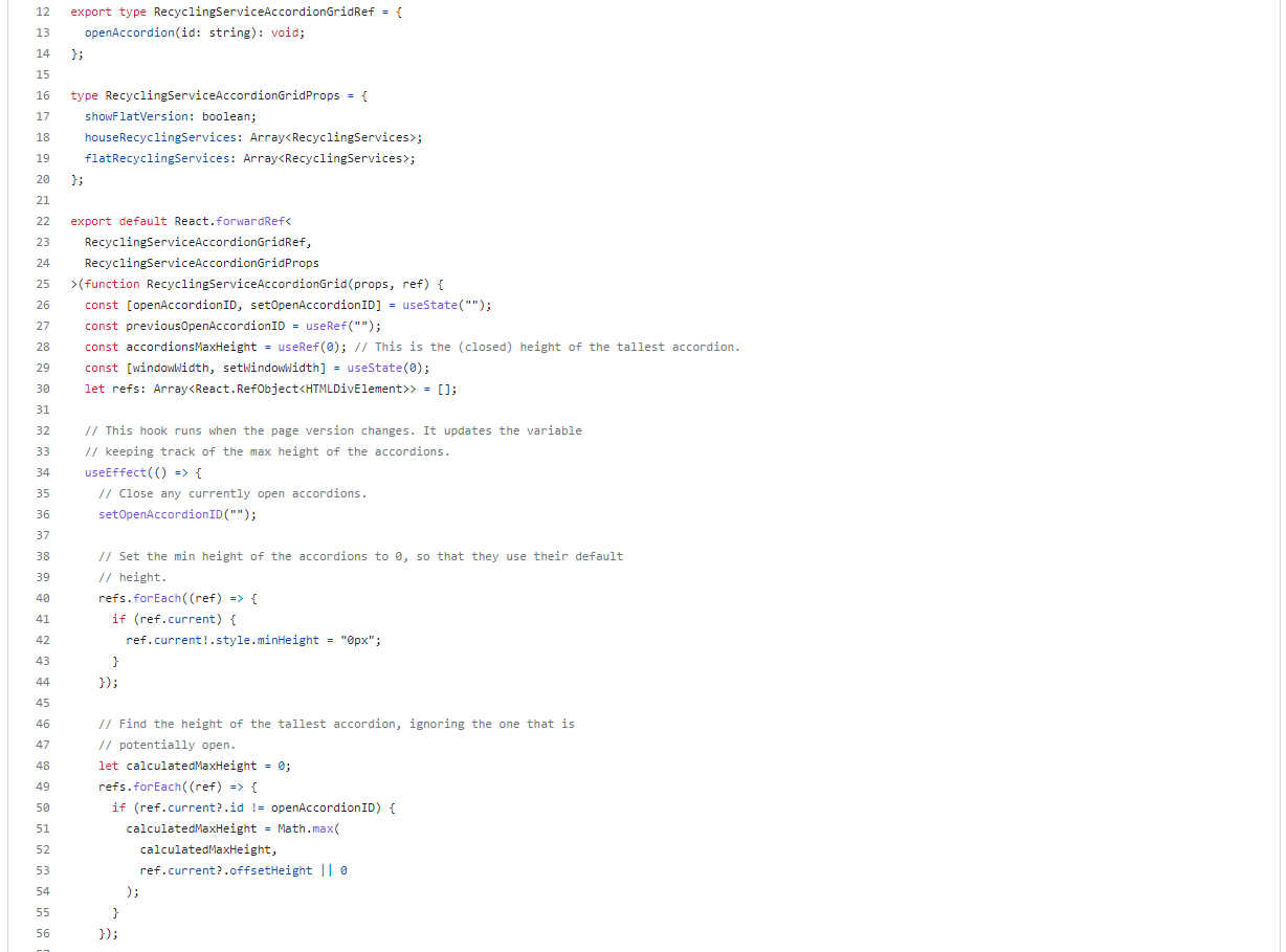
As time went on, I found myself having to use Google less and less and when I did use it, it was for more complex queries. I learned what state is and how to use hooks, both of which became staple parts of my future components. I was soon the go-to person for implementing front end components, which themselves became more complex: compare my initial code for the recycling service accordion grid with the final version of the very same grid, shown below. The former was mainly plain HTML while the latter is mostly TypeScript: as my skills grew, I was able to add more sophisticated functionality.
By the end of the project, I felt comfortable with React and my ability to understand and write code for it. Even if I end up not using React more in the future, I think that learning it was still a valuable experience. Learning a new skill is in itself a skill: for example being able to overcome that initial doubt in order to get started.
Teamwork
Teamwork is an essential skill for anyone to have, as most tasks will require at least some degree of cooperation with other people. Particularly in group projects such as this one, being able to effectively work together is crucial in order to succeed.
Of course I was no stranger to teamwork, having completed several joint assignments and group courseworks during my time at university. It is a skill that is taught from as early on as primary school. However, that does not mean that there is no room for improvement: on the contrary, I believe that teamwork is something that should be continuously improved. One of the great things about working with other people is that each group is different and has something unique to offer, and so each group project is a new learning opportunity.
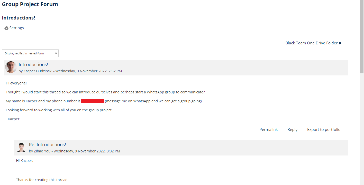
Right from the start, I decided to take the initiative and get the ball rolling. I created a post on the group forum introducing myself and proposed that we create a WhatsApp group to act as our main channel of communication. I was often the one who would first start discussing and planning the various things our group had to do. My previous experiences have taught me that not everyone is comfortable taking the lead and that without someone to guide the team and keep everyone focused on the tasks at hand, it is very easy to lose sight of the objective.
To help keep us on track, I suggested that we create a Trello board where we can write what needs to be done and who is going to be responsible. I also knew the benefits of having regularly scheduled meetings in order to check in with the progress of each team member and plan ahead for the coming week, so I proposed that we meet every Monday.
Being a good team member means supporting each other. Since most (if not all) of us did not know each other before the project, I wanted to make sure everyone was comfortable asking for help if they needed it - I didn’t want anyone to be shy or embarrassed. I was always happy to offer my own assistance whenever it was needed, but I myself also made use of my teammates when I needed support.
One aspect of working with other people that I struggled with a little bit was pull requests. We had agreed that before any branch could be merged with main, it would first need to go through a pull request and be reviewed by a different team member. While reviewing pull requests, I would often find myself comparing the code to what I would have written myself. While I believe this is a natural thing to do, it’s not necessarily the purpose of a PR review.
I needed to find a compromise between suggesting changes because they were “correct” and not just because something was done differently than what I would have done. To help me, I tried to ask myself objective questions such as “does this fulfil its purpose” and “are there any scenarios where this will not work as intended”. In essence, I focused on the potential outcomes rather than how they are achieved, since everyone has a different way of doing things.
Before starting the group project, I set myself a small goal. In the online tutorials for the MGPR module, we learned that effective teams are teams where everyone speaks for roughly equal amounts of time. I wanted to try and ensure that this was the case for my group. Unfortunately, I ran into a problem that I didn’t anticipate, although perhaps I should have.
I wanted to encourage some of the group members who didn’t speak as much during meetings to be more active in the discussion. However, at the same time I didn’t want to pressure anyone or make them feel uncomfortable. I found it difficult to figure out the right balance to be encouraging but not demanding. As someone who prefers to mostly listen rather than speak in group settings, I could relate to not wanting to be in the spotlight. As a result, I don’t think I did enough to try and get everyone to be involved in the discussion. This is something that I should work on in the future. Perhaps I could begin by privately asking teammates about their ideas, to try and boost their confidence.
Public Speaking
Another skill that I tried to develop during this project is public speaking. I’m a shy person and sometimes when addressing large audiences or strangers, I get flustered and speak unclearly or too quickly. This was something I wanted to improve upon.
How do I get used to public speaking? By becoming comfortable with being uncomfortable. I believed pushing myself out of my comfort zone was the way forward. In addition to trying to be an active voice in group discussions, I also volunteered to speak in most of the meetings with our challenge sponsor. I remember feeling very nervous before our first meeting and very relieved once it was over. However, each meeting I got through was another feather in my cap, proof that I can indeed do it.
The design brief presentations that took place at the end of the first semester were like a test for me. By this point, I had become comfortable (for the most part) speaking in the meetings with our challenge sponsor. However, for the design brief presentation I would need to speak in front of a much larger audience. Furthermore, the stakes were much higher as we would be presenting our design brief.
I tried to think back to previous times when I had successfully spoken in front of large groups. It was also comforting to see that other students were also nervous and that I was not the only one. Once it was over, I was proud of myself for getting through it. In comparison, the demo day demonstrations at the end of semester two were much easier for me. In fact, I was a bit surprised by how calm I was on the day, as I was expecting to be at least a bit nervous (it’s natural after all). Maybe it was the more informal nature of the presentations or maybe I was simply too tired! Or maybe, just maybe, my comfort zone had grown a little bit bigger…
Conclusion
Towards the end of the project, we ran a small user study (using university students) to evaluate our solution. Overall, our web application left all participants with a good aftertaste. They all agreed that our webpage helped them find the right recycling services quickly; using our website was at least twice as fast compared to the original Hounslow website (and in most cases even faster than that). Participants also enjoyed interacting with the various components, such as the fun facts/quiz questions, as well as the card flipping and accordion expanding effects.
More details of the study (including a test guide, plus qualitative and quantitative data analysis) can be found on the Miro board.
I enjoyed working on this project; it was a valuable learning experience as I got to use new technologies and develop both soft and hard skills. It was interesting to learn about AWS work culture and the different services that they provide. It was also exciting to work with a real public sector organisation like the London Borough of Hounslow. There are many lessons that I will take away from this. At the very least, I now know a lot more about recycling!
For more information about the project, you can read the full report or watch the project video.